Defination of UI/UX Design
UI/UX design focuses on creating seamless and engaging digital experiences. UI design deals with the visual elements of a product, such as layout, colors, typography, and interactive elements, ensuring it’s aesthetically pleasing and easy to navigate. UX design, on the other hand, focuses on the overall experience, aiming to optimize the user journey by making it intuitive, efficient, and enjoyable. Together, UI/UX design ensures that a product is both visually appealing and functional, meeting the needs and expectations of its users.
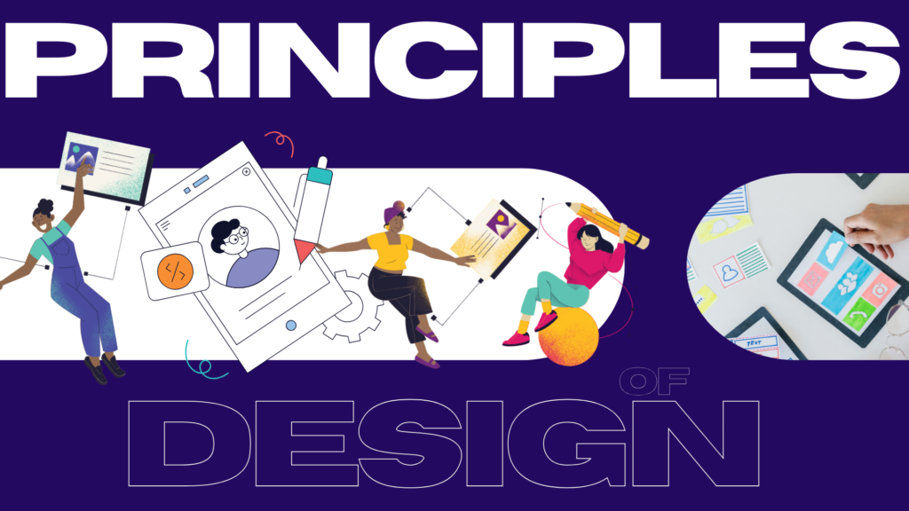
Principles of good UI/UX Design
Always prioritize the needs, behaviors, and goals of your target audience.
Maintain a uniform design language throughout the application or website. This helps users predict behavior and reduces cognitive load.
Strive for simplicity in design by minimizing complexity and focusing on essentials.
Accommodate a variety of user needs and preferences.
Provide users with immediate, meaningful feedback for their actions to confirm or correct behavior.
Guide users’ attention to the most important elements through proper visual hierarchy.
Main concept of UI/UX Design
The main concept of good UI/UX design is to create interfaces that are user-friendly, intuitive, and efficient, ensuring that users can achieve their goals with minimal effort and maximum satisfaction.
This revolves around:
- Understanding User Needs: Design should always center on the user, addressing their goals, challenges, and preferences.
- Balancing Aesthetics and Functionality: While a visually appealing interface is important, functionality and usability take precedence.
- Reducing Friction: The design should minimize confusion, unnecessary steps, or barriers that disrupt the user experience.
- Providing Feedback: Users should always feel in control, with clear feedback and guidance at every interaction.
I would like to share an example
Spotify is a popular example of a product with excellent UI/UX design, as it balances aesthetics, functionality, and user needs seamlessly.
User Interface (UI):
- Clean and Organized Layout:
The app has a visually appealing and uncluttered interface, with key features like the search bar, playlists, and library easily accessible.
- Consistent Color Scheme:
A dark theme with vibrant album art creates a visually engaging contrast.
- Iconography and Typography:
Clear and intuitive icons (like play, shuffle, and skip) and legible fonts make navigation straightforward.
User Experience (UX):
Personalization:
Spotify recommends playlists (like “Discover Weekly” and “Release Radar”) tailored to users’ listening habits.
Cross-Platform Integration:
Spotify synchronizes across devices, allowing users to start listening on one device and continue seamlessly on another.
- Seamless Navigation:
Users can switch between their library, current song, and home screen with just a few taps.
Why This is a Great Example:
Spotify’s design ensures users can discover, listen to, and manage music effortlessly. Its ability to deliver personalized experiences while maintaining simplicity and aesthetic appeal makes it a prime example of excellent UI/UX design.
Insightful quotes from industry leaders in UI/UX design